Influential Graphic Designers
Woody Pirtle
Woodrow Tyler Pirtle Jr was born in 1944 in Corsicana, Texas but later moved to Shreveport, Louisiana at the age of 3. He graduated from the University of Arkansas in 1967, but returned to Shreveport to work for a small, local advertising business. Though he was pleased with his job, Woody felt the need to move to Dallas, Texas in order to pursue his dreams of becoming a well-known graphic designer. This change to a larger city would make something of himself. Since then, he is a part of Alliance Graphique Internationale, served on the board of HOW Magazine and the American Institute of Graphic Design. Pirtle has taught at the School of Visual Arts in New York City while establishing his company Pirtle Design in Dallas, Texas (1978). As of today, his works have been displayed worldwide in various galleries and museums for over 25 years.
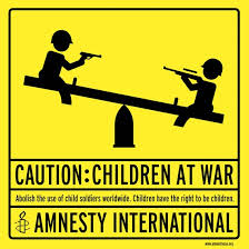
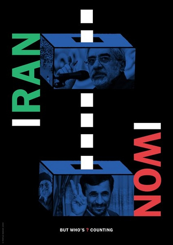
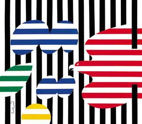
I admire Woody Pirtle's works of design since they are all creative, but promote a positive message of peace and non-violence. They catch the viewer's eye and allow them to stop and evaluate the point of the poster. Nowadays, issues like this are common and found worldwide, so I think that the underlying meaning of Pirtle's art is to create a better change in society by influencing the mindset of others. I support the cause and find the ideas behind each design interesting such as the first image which contradicts itself to catch the attention of spectators.

|
|

|
|
Paul Rand
Paul Rand was born on August 15, 1914 in Brooklyn, New York. He embraced the works of art at a young age while painting signs at his father's grocery store, but his father did not see a successful future in the arts department. This caused Rand to take night classes at the Pratt Institute, while being a self-taught designer. Throughout the years, he had many small roles in creating small ads at local stores, which eventually escalated to the designing of larger, more popular corporate company's logos. Paul is recognized worldwide for his works for IBM, UPS, Steve Job's NeXt, and the Esquire-Coronet Magazine's fashion page although he denied being at such an advanced level. He later on then died of cancer on November 26, 1996 due to Cancer in Norwalk, connecticut. Paul Rand is acknowledged as "the greatest living graphic designer".
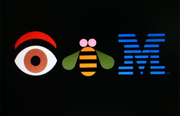
The designs and logos that Paul Rand have created are creative and eye-catching to me from his use of colour and symbols. I particularly like how effective the logos are in advertising the product/company, but are all simple. It doesn't have to be complex and detailed to be considered "good". For example, his work of art for IBM is promoted in a unique and different way by using symbols with the same pronunciations as the letters it consists of (Eye Bee M). Rand is a great graphic designer by using his strategy of "simple but effective" instead of making the posters feel and look loud/crowded. Too much detail will draw the viewer away from the message and throw them off since it would be difficult to focus on a single concept.
|
|

|
|
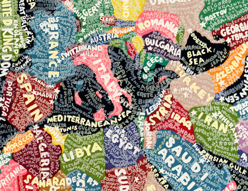
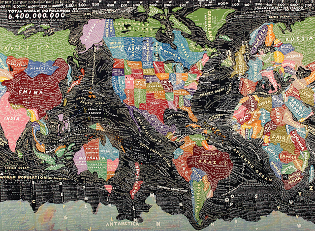
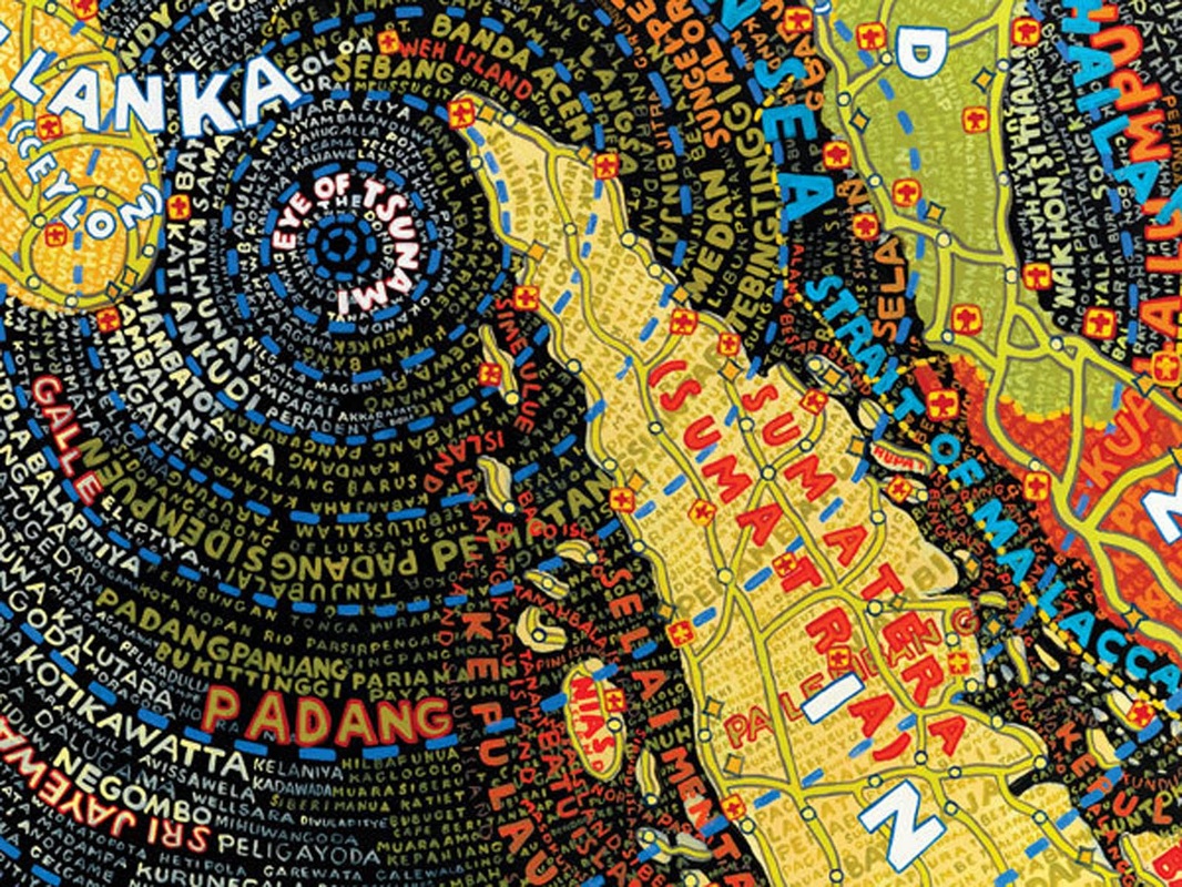
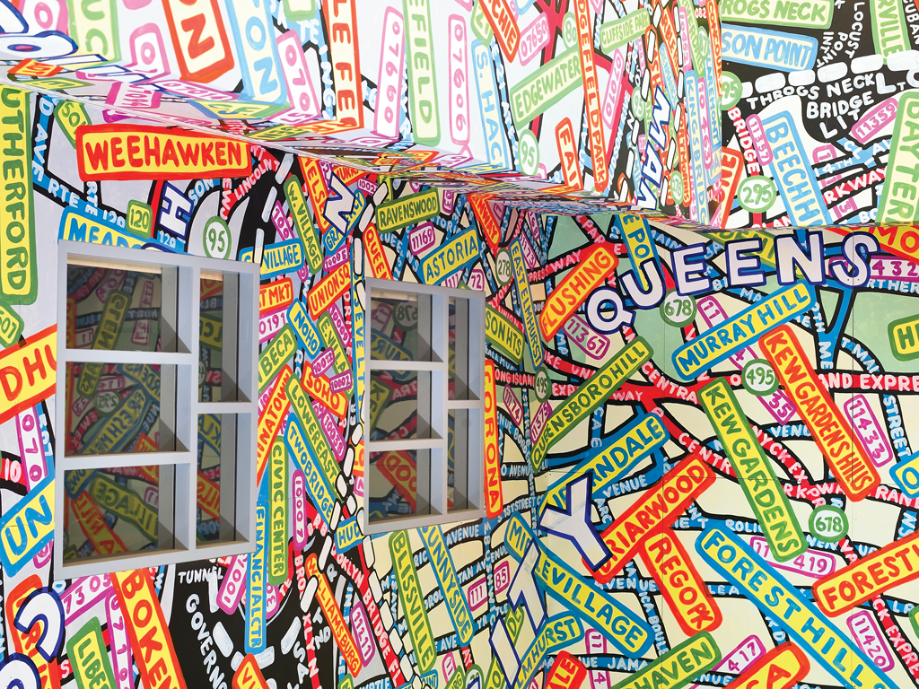
Paula Scher
Paula Scher was born on October 6, 1948 in Washington, DC. Growing up, she studied at the Tyler School of Arts in Philadelphia earning a bachelor in fine arts (1970). She later on moved to New York City to pursue her career as she took on the role of being a layout artist for Random House's children's books, and later on continued to be the album cover designer for CBS and Atlantic Records. As time passed, Scher co-founded Koppel and Scher in 1984 with fellow Tyler graduate Terry Koppel; identities, book covers, packaging and advertising were created in their company for a period of time. Unfortunately, their studio suffered from the recession causing both to part ways. Paula joined Pentagram as a consultant, eventually becoming a principal at the New York office (1991). Nowadays, she is the 16th person to be awarded the School of Visual Art's Masters Series Award and an exhibition of her work can be seen at the Visual Arts Museum.
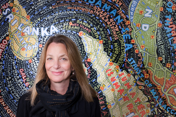
The maps and creations of Paula Scher are personally my favourite designs. Although they appear crammed and filled with detail, the colour choice makes the poster more intriguing and eye-catching to the viewer. It attracts spectators quickly and are able to keep their attention for lengthy periods of time. Her work makes looking at a map less plain and bland compared to the usual ones that we own. Her artwork appeals to all ages, even though younger children would not understand the concept of the map. The use of colour and word placement makes it have a cartoon effect which I like.
|
|
|
|
